What Goes Into a Data Visualisation?
17 March 2013
I thought it'd be interesting and useful to document the creation of my world migration map.
There's a lot of stages to creating a visualisation such as this and hopefully you will find this informative and insightful.
Getting the data
Much has been said about finding the data for a data visualisation and it never seems to happen the same way twice. In this instance I'd recently finished the Euro Debt world map and was feeling a bit unsatisfied with the dataset.
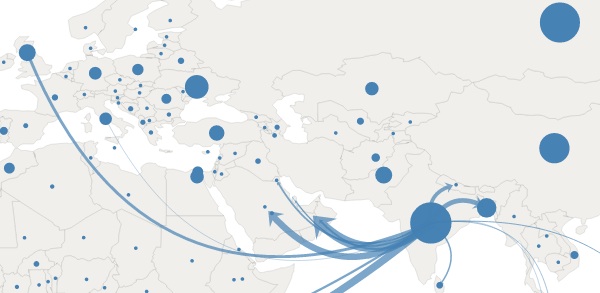
I wanted some data that was truly global, that people could really relate to and that would tell a story. I wanted to use the same chart concept, with animated arrows indicating some kind of flow between countries. Knowing that it's generally people, money and goods that flow between countries, one of the first thoughts was people migration. This is an interesting dataset from a story point of view - migration is something that touches most people's lives - and its also interesting data as it has a bidirectional flow: emigration and immigration.
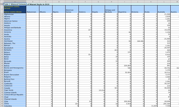
Searching for the right data initially wasn't fruitful, but through a stroke of luck I came across another migration visualisation peoplemov.in which links to an Excel spreadsheet of migration data from 2010 published by The World Bank.

So step one accomplished, we have data!
Converting the data
Most of my work is done in the browser so I use JavaScript most of the time and its native data format is JSON. Thus my next job was to convert the Excel data into JSON.
I use Numbers on the Mac and it doesn't export to JSON so as an intermediate step I saved the sheet as Comma Separated Value (CSV) data, knowing that this is a pretty standard format for further manipulation. I often write small, bespoke Python scripts to manipulate data into a more useful format and in this case I used Python's CSV module to read in the data.
I manually deleted some of the rows that were not required and wrote the Python to store the data in a dictionary with the format:
{
	"Canada": {
		"totalOut": 1185392,
		"out": [
			{"country": "United States", "amount": 834945}
		]
	},
	"Jamaica": {
		"totalOut": 986119,
		"out": [
			{"country": "Canada", "amount": 143675},
			{"country": "United Kingdom", "amount": 158203},
			{"country": "United States", "amount": 649046}
		]
	}
	etc.
}
In order to reduce file size, information overload and processing weight in the browser, I set a threshold of 100,000 people between two countries. This was an arbitrary figure to get me started and I knew that I could go back and adjust if necessary.
I believe that for a visualisation such as this, there's only so much information the viewer can take in and that it can be better to focus on the more significant data (whilst not hiding the less significant).
Geocoding the countries
In my Euro Debt visualisation I made a JSON object to store each country's latitude and longitude points. I have to admit that I populated this by hand, which for a handful of countries is bearable.
The migration visualisation will have just over 200 countries so I didn't fancy doing this by hand; I have to say a big thank you to Google for their Geocoding API. You can send it an address, a postcode or even a country name and it'll return the latitude and longiture.
A big thank you to pygeocoder too which makes geocoding a bunch of country names a relative breeze. Not completely, as Google has a rate limit so I had to enforce a bit of throttling (2 requests/sec) to prevent my script failing!
So now we have a JSON object with the country lat/long data:
{
	"Canada": {"lat": 56.130366, "lon": -106.346771},
	"Turkmenistan": {"lat": 38.969719, "lon": 59.556278},
	"Lao PDR": {"lat": 17.9454864, "lon": 102.620515},
	"Lithuania": {"lat": 55.169438, "lon": 23.881275},
	etc.
}
It's also worth mentioning that one or two countries weren't recognised by Google's API so I entered them in by hand.
Adapting the existing chart
I already had the Euro Debt chart code so a lot of the coding had already been done. In short, this code:
- uses Raphaël for drawing the SVG
- displays each country as a circle
- when a user hovers over a circle, plots lines from the country to its associated countries
- updates the legend with the data
The reason for choosing Raphaël is that it made animating the arrows pretty straightforward. Each arrow is a quadratic spline with an arrow symbol at the end. Raphaël has a useful subpath function that when given a path, a start point and an end point, returns the path between the two points. Thus to animate an arrow, we animate the path data using Raphaël's animate function.
Inserting the migration data into the existing codebase was fairly painless with just a few niggles. For example, Google geocoded Georgia (the country) as Georgia (the American state).
Another niggle was that the migration of Mexicans to the USA results in a pretty big arrow and given their close proximity, the rendering of the arrow doesn't work very well. I thought about scaling this one data point, but felt this was misrepresenting the data. I also tried moving the centroids of the two countries, but this didn't feel right either. So I've left it as it is.
Once I'd got the emigrations working, I went back to the Python script and added in immigration data and modified the JavaScript code so that the user can switch between emigration/immigration.
That's all!
So there you have it. Not a hugely drawn out process, but one that involves a lot of different skills and knowledge and, I have to say, a very exciting process. Seeing the data on the world map for the first time was very gratifying!
