F1 Timeline: Part One (Design)
21 October 2014
This is the first of a series of two articles on the creation of the F1 Timeline starting with the visual design. The other article discusses the implementation of the visualisation.
Aims
When designing a data visualisation, or anything for that matter, it's important to be clear about one's aims. In this case I wanted to:
- give a visual overview of F1 drivers showing their success rates at a glance
- show the start and end ages of drivers
The first aim is rather vague. I suppose it can be translated as: what does F1 history look like?
Background data
F1 as a world championship started in 1950 and at the time of writing 826 drivers have competed in a total of 913 races. In terms of driver placings we're talking somewhere in the region of 22,000 results. After a bit of searching around I found a very useful database of F1 results at ergast.com which provides all the required data.
Initial designs
My first step was to make a simple visualisation of all the drivers using D3. Each row represents a driver and each circle a race results. Time progresses from left to right. Black indicates a win, dark grey a podium etc.

We can see that this simple visualisation already reveals patterns in the data. We can see each season as a group of circles and the more successful drivers stand out as series of darker circles. It also became apparent that there would be challenges in presenting the whole of F1 history.
The image above just shows a handful of the 826 drivers and just 7 of 65 seasons. Zooming out to get a sense of how much data we're dealing with we see something like:
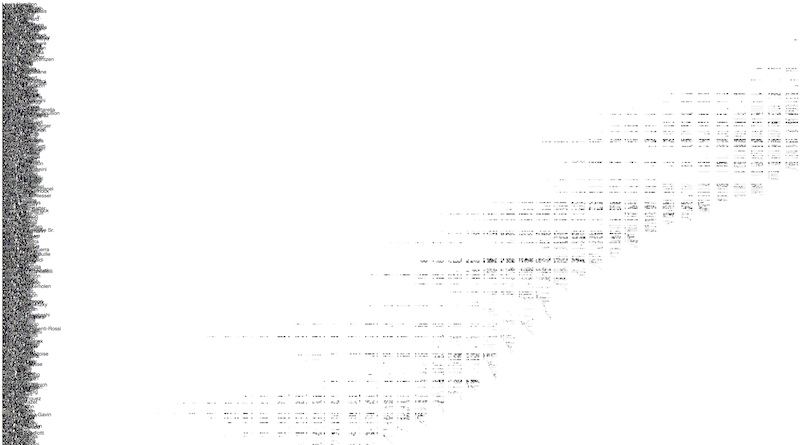
Clearly we've a conflict between displaying all the data (in order to get a sense of the big picture) and the legibility of individual drivers. In the above image, the mess on the left hand side is the driver names!
At this point I took the decision to use a big canvas thereby allowing the user to scroll around the visualisation. I wasn't concerned with the prospect of vertical scrolling but horizontal scrolling is relatively unusual these days. Therefore I added an option to allow the user to switch to a widescreen view.
Graphical marks
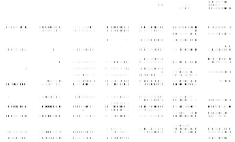
Each driver has a number of results, for example 'Fernando Alonso finished 3rd in the 2013 Brazilian Grand Prix', with each result being represented with a graphical mark. I experimented with circles and rectangles of various sizes and in the end I chose to use rectangles mainly because they give us a larger view and hover/click area than the equivalent width circle.
Colour scheme
I was surprised at how effective the greyscale colour scheme was but I felt that it could be improved as representing more than 3 values with shades of grey is not advised. I wanted to be able read drivers results quickly, being particularly interested in wins and podiums. A number different colour schemes were experimented with including:
- green and greyscale on white
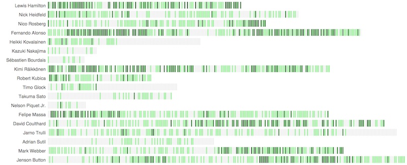
- green and greyscale on black
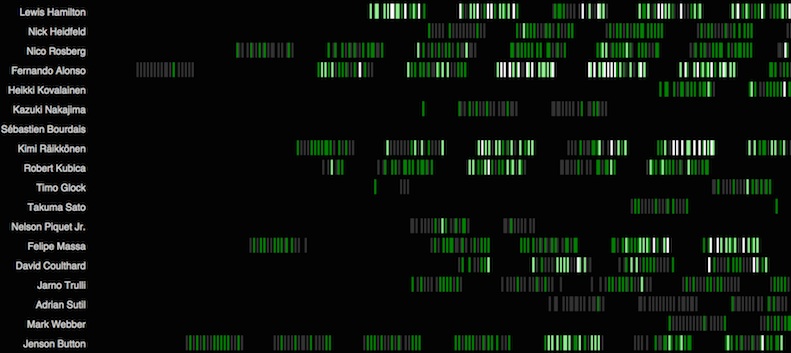
- orange and greyscale on black
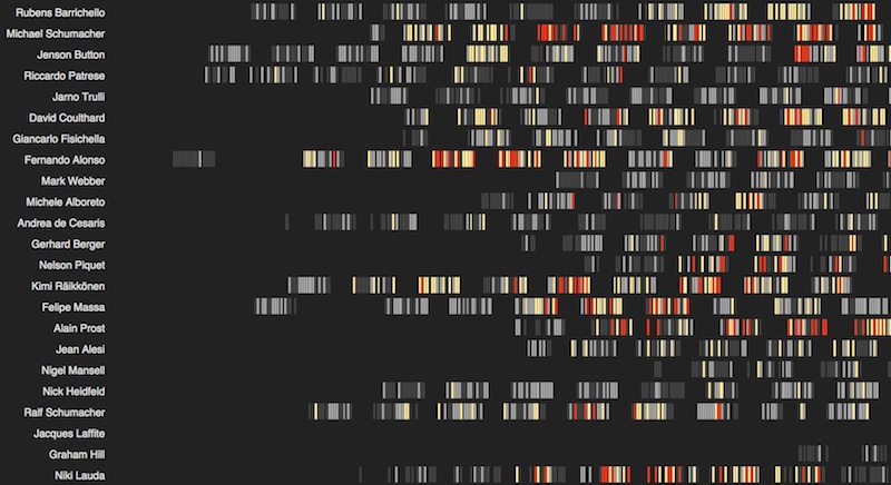
The orange and greyscale scheme uses a combination of two scales from ColorBrewer: two shades of orange for wins and podiums and two shades of grey for top 10s and other results.
This was my favourite colour scheme as it has a nice balance of visual appeal and clarity. Wins and podiums are easily found - just look for coloured rectangles, whilst lower results are in two shades of grey.
The visualisation provides a barcode or fingeprint-like snapshot of a driver's career. For example, if we look at 4-times world champion Sebastian Vettel we can see a rapid rise to success, his first win coming in his first full season followed by several championship-winning seasons and then a less successful season with several top tens, a few podiums but no wins.

Michael Schumacher had a similarly fast rise scoring several podiums and his debut win in his first full season. He had two championships with Benetton then 4 years with Ferrari before becoming world champion 5 times in a row. He retired for 3 years before returning with Mercedes for 3 seasons where he achieved many top ten finishes and a single podium.

In contrast, Jenson Button had a slower rise to success, with many podium finishes occurring in his 5th season and a championship winning year after 2 disappointing seasons with Honda.

Story telling
There's a lot of data on show (more than 22,000 data points) so to reduce users getting overwhelmed I introduced some storytelling to the visualisation. This would not only tell a story about some of the drivers but would help the user get used to looking at and navigating the visualisation.
The story starts by looking at how drivers and getting younger and then looks at some of the more successful drivers. It automatically scrolls to the different drivers which hopefully suggests to the viewer that they can do the same when they take control.

Sneakily, the storytelling also gives some extra time for the majority of the data to be rendered in the background, but that's another story.
User experience
Once the storytelling is finished the user can take control and explore the visualisation. Initially I added separate controls for the x-axis and driver sorting but in the end decided that this gave too much flexibility.

Therefore the final design has just two controls: one for choosing between three different views (ages, timeline and histogram) and the other for switching to the wide-view.
Much of the user experience is driven by detailed design, including:
- x-axis labels that stay fixed in position during vertical scrolling
- floated driver labels (otherwise driver labels get estranged from race results)
- additional axis tick labels in widescreen view
- automatically scroll to key areas when a new view is selected (otherwise the user might be faced with a blank screen)
- a tooltip when results are hovered over. This also proves useful when the driver name has disappeared off the screen.
Summing up
Hopefully this article has given some insight into the design work that goes into creating an interactive data visualisation. In another article I'll discuss how this visualisation was implemented, including:
- acquiring and transforming the data
- coding (SVG, CSS, D3)
- optimisation
In the meantime, enjoy the visualisation!